
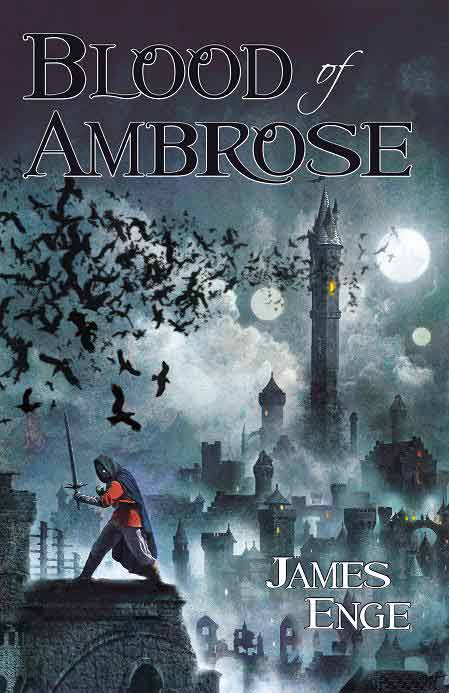
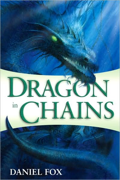
 More Than WordsbyGillian PolackI love books. Not just the insides, but the feel of them. Not just the front cover, but the spine and the back and how the whole fits together. I always look at title pages carefully before I read a book and check out acknowledgements and dedications. The best books, to me, are more than stories. Some very special books I keep where my friends can reach them down anytime, because they command lots of attention. Shaun Tan’s The Arrival is one such volume. The beauty of a well-crafted book is that I don’t get excited about it just the once: I fall in love with it over and again. It’s a special joy. The Pyr publishing house sent me some books the other day for possible reviewing. The novels they sent may lead to reviews or essays down the track, but when I opened the box I picked them up and I looked at them and I forgot all the work I had to do. I laid them all in a row across the back of my couch and I admired them that way. I put them in one order and then in another. I got out recent books by UK and Australian publishers and moved everything round to see how different the styles were. Finally, I packed most of the books I had been enjoying in a bag and I persuaded a few friends of mine to look at them too, and to give me their thoughts. I definitely don’t look at covers exactly the same way my friends do, although there was some overlap. And some surprises. I’ll talk about the surprises later. Firstly, let me introduce the books. Introducing the Books: And very interesting packaging it is, too. It’s interesting despite the fact that I won’t comment on the paper or overall quality because the books represent different aspects of the market and there are natural differences between a trade paperback, a good quality hardcover and a mass market paperback. I’m not commenting on the interior at all (not even the typefaces)—that’s a story for another day. Belong edited by Russell B. Farr. An Australian speculative fiction anthology. The back copy says “23 tales of interstellar wanderers, migrants, colonists, zombie refugees, interplanetary poets, fallen angels, storytellers, neighbours, first peoples, last peoples, lost peoples . . . people searching for a place where they belong.” Cover dark with a flash of light (looking at a planet from space). Best Served Cold by Joe Abercrombie. “Springtime in Styria. And that means war.” says the inside of the jacket. The outside has a map that extends the whole way round (in the style of Tolkien maps, which suggests epic fantasy), a sword that extends the whole way round (across the spine, round the back and off the page—it’s a bended sword) and blood that gets everywhere. Also some stray gold coins. Blood of Ambrose by James Enge. An alternate somewhat Arthurianish fantasy—part of the Morlock Ambrosius series (see This Crooked Way, below). The cover is filled with dusk and dark towers and ravens. A man with a sword and a red shirt is standing, sword ready to fight. Window-eyes watch, balefully. The Crown Rose by Fiona Avery. This book is a few years older than the others and hardback. The difference in design is immediate. The cover suggests historical fiction, with a picture of a girl seen through a window, in dress that’s definitely not modern. The colours are gentle browns and umbers. The back cover says that “The Crown Rose hurls us into France in the Thirteenth century” and makes it clear that The Crown Rose is historical fantasy. Dragon in Chains by Daniel Fox. No stunning headings on this cover, just a straightforward introduction to the plot. The introduction to the introduction (at the top of the page, in pale green text) explains the book as “a ravishingly written epic of revolution and romance set in a world where magic is found in stone and in water, in dragons and in men—and in the chains that bind them.” The cover is dark and muddy, the blues of deep underwater, with a dragon curling over the white strip on the front that contains the title. End of the Century by Chris Roberson. Alice Fell, a teenager at the end of the millennium, on the run. A detective from a century before. Galaad, from the sixth century. The barriers between times break down. The three from their respective centuries are on the cover front cover (the spine and back are black with red and white text), confronting the reader. Alice carries a sword and has a halo. The colours at the centre of the picture are harsh blacks and reds and skin tones, but towards the edge they are softer and less complex. Ghosts of Manhattan by George Mann. “Introducing the World’s First Steampunk Hero” says the back copy. Alternate history of a particular, dark variety. Very jazzy. Cover sepia with splashes of red, full of angles, a shadowy man with red eyes, coat blowing backwards towards the Flatiron Building. Scary Kisses edited by Liz Grzyb. As the cover says “A collection of paranormal romance with bite.” There are red stripes with darker red patterning (like furnishing material) at the top and bottom and, in the middle, a cartoon femme fatale dressed in red and black, plus cat. The cat appears on front and back cover, winking at the reader from the front and ignoring everyone entirely from the back. Solace & Grief by Foz Meadows. Not a cheerful cover. This fits the nature of the book. “Solace Morgan was born a vampire” the text tells us, and it’s a novel about her journey to find out about herself and her world. All black except for a textured bronze key. The key drips blood and the red is taken up by the author’s name and by a shadowed red-lit picture of what may be a church on the back (though the back text suggests it could also be intended as a medieval dungeon, albeit one with a rose window). This Crooked Way by James Enge. A vaguely Arthurianish fantasy, with a sword on the back cover to prove it. The hero is Morlock Ambrosius “bitterly dry drunk, master of all magical makers, wandering swordsman, and son of Merlin Ambrosius and Nimue Viviana” and the cover is dark reds and red-browns, full of fire and angry light. World’s End by Mark Chadbourn. “In time of trouble, heroes arise!” The times of trouble are caused by Celtic gods and their reappearance. The cover has a Green Man looming gigantic over five very tiny humans, silhouetted against a vast sky. The Focus Group and Their Thoughts: I asked my group a series of questions, each reflecting my curiosity on how other people respond to book covers. My favourite question was “Which books would you buy from seeing the cover?” This is because it’s the one I always get asked, and I believe in sharing the pain. C would buy Ghosts of Manhattan based on the cover and possibly Abercrombie’s Best Served Cold. He liked, but would not buy, the Avery and the Roberson, but the Roberson would depend on the front facing him as he didn’t find the spine tempting. Most of the books C liked were North American and from Pyr. The only exception is Abercrombie’s Best Served Cold. He later admitted that he admired Abercrombie’s writing, so the name of the author was probably more important than the cover art. D created an instant list. She was very decisive: Scary Kisses, Ghosts of Manhattan, Belong, Best Served Cold and The Crown Rose. She used the covers to create a sense of genre and decide if they were her kind of book. Belong, in particular, benefited from this analysis, she explained, as she particularly likes science fiction. She has trouble classifying most of the Pyr titles as anything other than Young Adult, however. A would buy World’s End from the cover, but not the Abercrombie. (“It’s too clichéd.”) She loved the cover of the Avery, and would take a second look at the second book by Enge. What’s particularly interesting is that all the covers that tempted her into opening the book and starting to read came from the same publisher, Pyr. The Australian covers didn’t tempt her. Belong was too science fiction and Scary Kisses didn’t indicate its genre clearly enough, for instance. Abercrombie also tempted B, but only to look at, not to buy. When pressed further, he explained that he would want to look because he couldn’t tell from a distance if the book was fantasy or historical and he was curious. The cover to Roberson’s book also appealed and might drive a purchase, as did Dragon in Chains (he likes books with dragons) but Ghosts in Manhattan was the clear winner and had the most intriguing cover. B was the only person who didn’t give a clear preference to Pyr when contemplating purchase. We explored the Pyr covers specifically, because it didn’t matter what questions I asked, there were always Pyr covers listed in the favourites. The group felt that the Pyr covers “captured a feel” and were less generic than some of the other covers. Only one Pyr cover was considered a bit try-hard (by which, they explained, the action pose looked contrived) and that was the Roberson. As I explained earlier, however, one of the group thought the feel Pyr captured in most of its covers was specifically Young Adult. It was interesting to hear the group reach and then voice a contradiction: the cover to the Roberson book was trying too hard, yet at the same time it was tempting enough to possibly persuade someone to buy the book. Because of the contradiction, I pushed a little further (I’m a cruel person) and the men explained the expressions on the faces were a problem. “Trying to be tough,” one of the group suggested. They pointed to the Ghosts in Manhattan cover as being ‘not try-hard’ and someone helpfully pointed out to me that only seeing red points for the eyes and no facial features at all looked much tougher. D didn’t quite agree. She still liked the Ghosts of Manhattan cover, but she really enjoyed seeing the faces of real people on the covers. This put her in direct opposition to C, who felt it interfered with his interpretation of the character. May they never go shopping for books together! I asked the group to pile the books into ones with appeal for men and ones with appeal for women. I added myself to the group for this exercise, and D missed that particular question (I forgot to ask her). Seven books were classifiable and all the rest were declared gender neutral. The ‘blokie’ books were by Enge and Mann. The ‘girlie’ books were Avery’s The Crown Rose, Gryzb’s Scary Kisses, Roberson’s End of the Century (‘girlie in the same way Buffy is girlie’ we qualified) and possibly Mark Chadbourn’s World’s End (“There’s something about the Green Man...”—when looking at the shortlisted artists for this year’s Hugos, I was not at all surprised to find this John Picacio picture in the judging pack. Shaun Tan, who wrote one of my reach-for-at-any-time-because-it’s-special books, was also there, which made me doubly happy.) Although the team each had time and space and picked up each and every book several times, no one stopped to read the text on the back except to determine genre and if it was ‘their’ style of book. Three of them said “I don’t like all this text,” and promptly put books with a lot of text right back down again. Despite everyone showing a marked preference for Pyr books in every other respect, those Pyr books with text on the back were commented on very strongly. On the other hand, Abercrombie’s Best Served Cold was condemned just as roundly for having no text at all. “How can I read it if I don’t know what type of book it is?” someone complained. Solace & Grief scored some criticism for a cover looking like dark horror when the back text suggested Young Adult paranormal. Scary Kisses was singled out for not looking paranormal, “Although you can tell it’s romance.” After the complaints, I wanted to know what they actually liked about the covers. There were several that my friends explained as having a nice period feel to them: Belong, Scary Kisses, The Crown Rose. Others (Blood of Ambrose, This Crooked Way, World’s End, Ghosts of Manhattan) demanded to be read at once. Solace & Grief and Best Served Cold were interesting in the way they used ephemera, the group said. Scary Kisses and Ghosts of Manhattan were the books that were picked up and handled and returned to and enjoyed the most, and Ghosts of Manhattan was definitely the favourite across the board. I asked the artist to comment on the covers as art. He pointed out that all this is personal (and he’s the one who likes dragons, so one would presume he has particular ideas about dragons). He dismissed one cover instantly “The seams are showing,” he said. He thought the cover of Dragon in Chains cover “hit the mood really well.” Ghosts of Manhattan with its movie poster effect sold the idea nicely, and was intriguing. “We don’t know what’s going on,” B said, “It makes you want to see.” He thought the cover for Blood of Ambrose was particularly well done, too, except that the red clashed instead of standing out. While Scary Kisses didn’t appeal to him as a book (he’s not a paranormal romance reader, it seems) he thought the cover did an excellent job of making it look interesting. He loved the Pink Panther cartoon feel. My Thoughts: What I’m beginning to suspect is that most covers convince people who are halfway to buying books into picking one book up instead of another. There are other forces at work that made my friends gravitate towards one good cover over another. I took notes of the words that got thrown out when someone was excited. “Steampunk!” “I love the cartoon feel.” “Dragons!” “Science fiction.” “A new Abercrombie.” These were what my friends actually said, before and during questions. The author and the theme are arbitrated by the cover, which is important, but only one of the words that crept out without prompting had anything to do with design. The two biggest components in that equation from all three of my test subjects, was whether they knew and trusted the writer or whether they had a particular fondness for the subject matter. The Abercrombie, which elicited the reaction ‘I wouldn’t buy this book even though the cover is attractive, because it doesn’t tell me enough about the book” from all three people, also elicited “Mind you, I read Abercrombie, so I’d buy it because of that.” What I found really interesting was that once this identification was made—”Dragons!” “Steampunk” “Abercrombie”—the favourites shifted around a little and some books that had been neglected early on became favourites. The most notable change in status happened with Fox’s Dragon in Chains. “Dragons!” Only one book trumped throughout because of the cover; Ghosts of Manhattan. It had one of the key themes “Steampunk.” Everyone also loved the cover design, however. My friends, from A to D, returned to it over and over, adding more to their reasons for liking it. If any book had not made it home with me, that would have been the one. My conclusion is the surprising bit. For me it was, anyhow. Pyr is a US publisher. Pyr books are hard to get hold of in Australia. We’re told that US market needs are different to Australian and British and so the cover art is different and the colours reflect local tastes. I did my own little check-up on that. I lined the US books up and I lined the UK/Australian books up. There are colour differences, mainly, and some style difference. The US covers played with colour much more and weren’t averse to using more saturated hues. This is why D regarded them as Young Adult. Put a dozen new Australian and UK publications next to each other and the overall effect is elegant, dark and maybe a bit drab. Individually, they’re still interesting, but the US covers pulled my focus group and myself far more irresistibly. Most of the US books were from the one publisher, so this isn’t indicative of anything except that Pyr obviously knows how to do a good cover. It bears thinking about, however. Given that my friends overall preferred the US covers, it makes me wonder if the cultural differences are as great as I thought. Books mentioned in this column: Gillian Polack is based in Canberra, Australia. She is mainly a writer, editor and educator. Her most recent print publications are a novel (Life through Cellophane, Eneit Press, 2009), an anthology (Masques, CSfG Publishing, 2009, co-edited with Scott Hopkins), two short stories and a slew of articles. Her newest anthology is Baggage, published by Eneit Press (2010).One of her short stories won a Victorian Ministry of the Arts award a long time ago, and three have (more recently) been listed as recommended reading in international lists of world’s best fantasy and science fiction short stories. She received a Macquarie Bank Fellowship and a Blue Mountains Fellowship to work on novels at Varuna, an Australian writers’ residence in the Blue Mountains. Gillian has a doctorate in Medieval history from the University of Sydney. She researches food history and also the Middle Ages, pulls the writing of others to pieces, is fascinated by almost everything, cooks and etc. Currently she explains ‘etc’ as including Arthuriana, emotional cruelty to ants, and learning how not to be ill. She is the proud owner of some very pretty fans, a disarticulated skull named Perceval, and 6,000 books. Contact Gillian.
|